Another from Australia! Moscow was released by Australian boutique polish maker Picture Polish as a Collaboration shade in October 2014. It was designed by Sasha Plein, co-founder of the nail-ru online community, and is one of if not the first Russian Collaboration polishes. If you would like to see Sasha's post about her shade and its inspiration, you can find a google translate (Russian to English) version of that here.
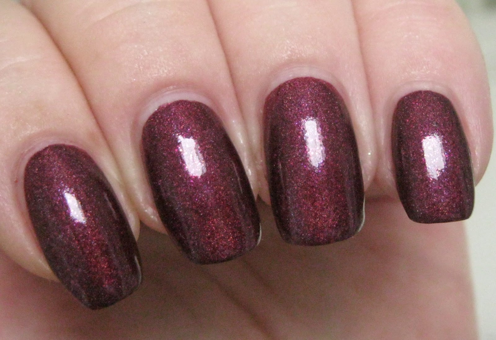
Moscow is officially described as a "complex deep maroon bijou holo" bearing a mix of delicate small holo particles and sparkling metallic flecks of raspberry pink and violet-blue. I consider maroon to be a somewhat rustic, earthy variation of burgundy, kind of a blend of dark red with brown and purple, and I wouldn't classify this polish as a maroon. For me, the predominant red/purple tones of Moscow put it over amongst the purpled-berry/wine branches of the burgundy family tree. By design, there's an abundance of romance built in to this polish and it feels much more complex than a straight burgundy, with dimensional aspects of Tyrian purple, mulberry, and raspberry rose. As a creme holo, the holographic effects produce beautiful color nuancing to the base. Soft, feminine shades of red-violet, plum and rose bloom from within its depths, punctuated by tiny twinkling sparks of pinkish red from the shimmery flecks and shading to darkest claret at the sidewalls. It's overcast and raining here again today, but from the photos I've seen of this polish online, direct sun elicits a glowing prismatic flare in warm, ember-like hues of flame and blood orange that is edged with sparkling wisps of indigo, violet and blue.
Application was delicious. The consistency of Moscow is fluid, light and creamy with a plush glide over the nail and outstanding self-leveling properties. This is a supremely user-friendly polish, amenable to thin or thicker coats and easy to manipulate with Picture Polish's wonderful flattened flexible brush. Pigmentation is also outstanding, with wearably opaque coverage in one coat. A second coat deepens and enriches the color and, in my opinion, augments the holographic effects as well. Cleanup is fairly straightforward with a bit of pigment travel in addition to some stickiness on the part of the flecks. Moscow dries naturally in very good time to a silky smooth, slightly flat finish. Topcoat adds a becoming gloss and accentuates the presence and effect of the shimmers.
Photos show two coats of Moscow over treatment and basecoat with a topcoat of Seche Vite.
 |
| Picture Polish Moscow |
 |
| Picture Polish Moscow |
 |
| Picture Polish Moscow |
 |
| Picture Polish Moscow |
 |
| Picture Polish Moscow |
 |
| Picture Polish Moscow |
 |
| Picture Polish Moscow |
 |
| Picture Polish Moscow |
 |
| Picture Polish Moscow |
 |
| Picture Polish Moscow |
 |
| Picture Polish Moscow |
 |
| Picture Polish Moscow |
 |
| Picture Polish Moscow |
You can see that Moscow has that delicious refined Pointillist sort of speckling to its finish from the holographic pigment and the fleck shimmers, giving the look a graceful dimensionality and depth that pairs well with its sophisticated, cosmopolitan nature. To me, this polish is just poignantly beautiful.
If you would like to see how Moscow compares to "similar" Picture Polish offerings, there's a great on-the-nail comparison of Focus, Monroe and Moscow with Zoya India thrown in as well on lakkomlakkom.
love,
Liz
complex deep maroon bijou holo


No comments:
Post a Comment